
Warm, Grounded, and Made for Your Exterior
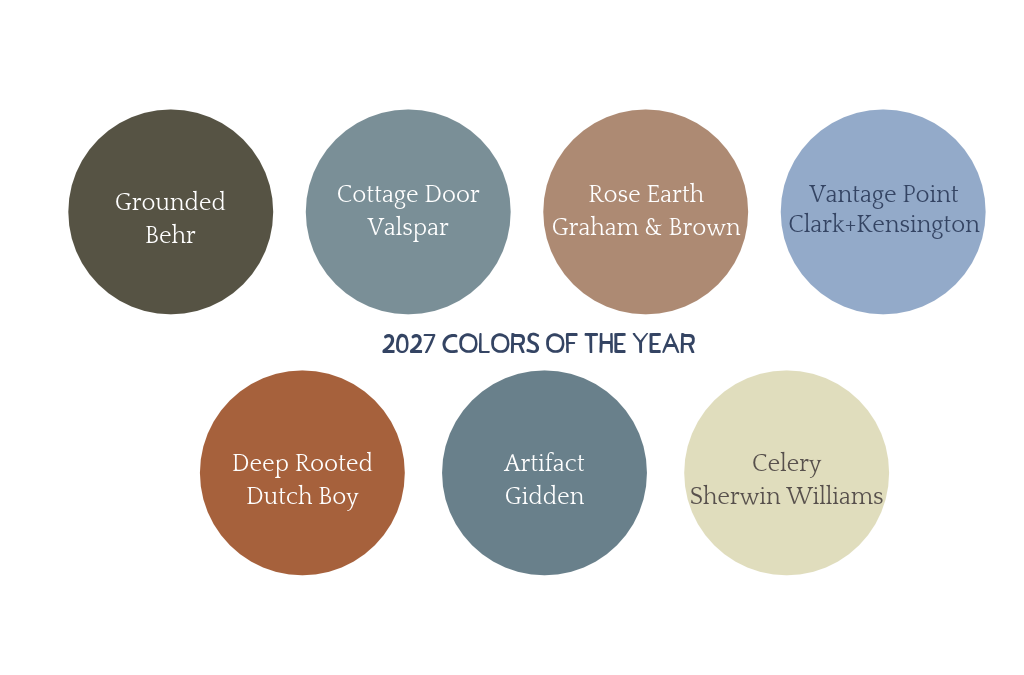
As we head into 2027, the design world is doubling down on something that feels increasingly rare — intention. 2027 colors of the year selections from the major paint brands share a common thread: warmth, depth, and a quiet confidence that feels anything but ordinary. From rich earthy terracottas to sophisticated blue-greens, the 2027 palette is one that translates beautifully to exterior design — and we’re here to show you exactly how.
Warm & Earthy Tones
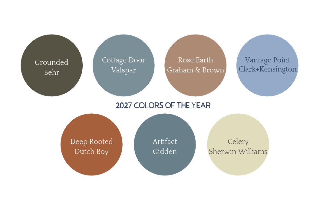
Rose Earth — Graham & Brown
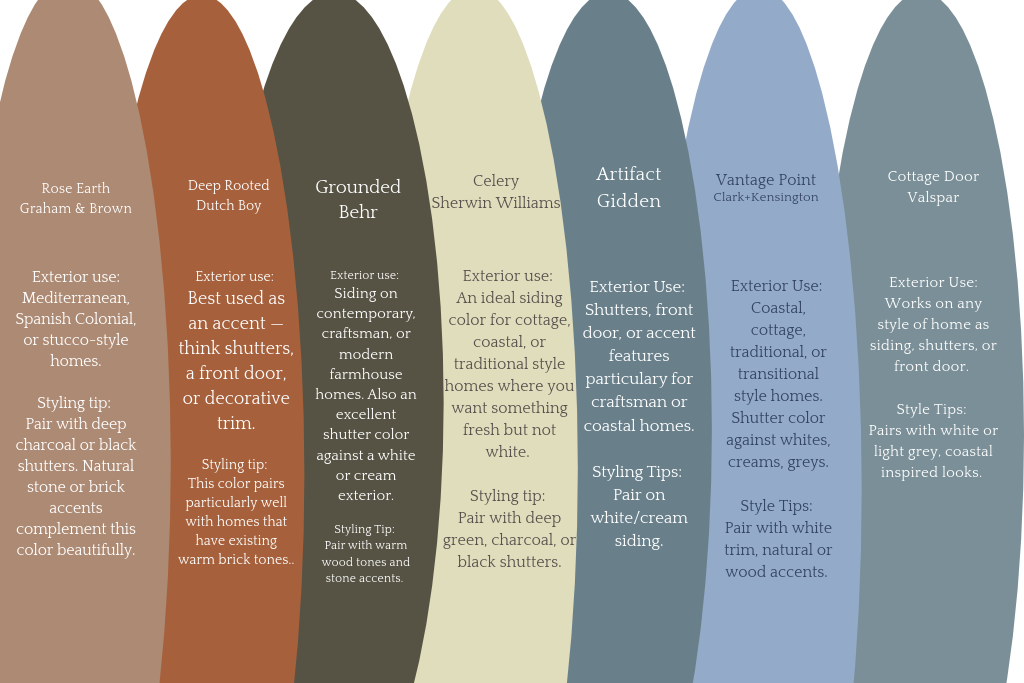
Rose Earth is a warm, dusty terracotta — soft enough to feel approachable, rich enough to feel intentional. It sits in that beautiful space between pink and brown that feels timeless rather than trendy.
- Exterior use: A stunning choice for siding on Mediterranean, Spanish Colonial, or stucco-style homes. Also works beautifully as an accent color on shutters or a front door when paired with a neutral exterior.
- Styling tip: Pair with deep charcoal or black shutters and warm bronze hardware for a sophisticated, earthy combination. Natural stone or brick accents complement this color beautifully.
Deep Rooted — Dutch Boy
Deep Rooted is a rich, burnished rust — deeper and moodier than Rose Earth with a confidence that commands attention from the street.
- Exterior use: Best used as an accent — think shutters, a front door, or decorative trim — rather than full siding. It adds warmth and character to homes with neutral or cream-colored exteriors.
- Styling tip: Ground it with dark hardware and natural wood or stone accents. This color pairs particularly well with homes that have existing warm brick tones.
Grounded Neutrals
Grounded — Behr
Grounded is a deep, muted olive-charcoal — the kind of color that reads as sophisticated and serious without feeling cold. It has just enough green in it to feel connected to nature while still anchoring an exterior with real presence.
- Exterior use: One of the most versatile colors in this year’s lineup. Works beautifully as full siding on contemporary, craftsman, or modern farmhouse homes. Also an excellent shutter color against a white or cream exterior.
- Styling tip: Pair with black hardware and white trim for a clean, high-contrast look. Or soften it with warm wood tones and stone accents for something more organic.
Celery — Sherwin Williams
Celery is a soft, creamy yellow-green — light and airy with just enough warmth to keep it from feeling cold. Think of it as a sophisticated alternative to traditional off-white.
- Exterior use: An ideal siding color for cottage, coastal, or traditional style homes where you want something fresh and light without going stark white. It gives an exterior a gentle, lived-in charm.
- Styling tip: Pair with deep green, charcoal, or black shutters to create contrast and highlight architectural details. White trim keeps it feeling clean and classic.
Blue & Blue-Green Tones
Artifact — Gidden
Artifact is a deep, moody blue-green with a vintage quality to it — rich and layered in a way that feels collected rather than trendy.
- Exterior use: A bold and beautiful choice for shutters, a front door, or accent features on a lighter exterior. On the right home it works as full siding too — particularly on coastal or craftsman style homes where a deeper hue feels at home.
- Styling tip: Pair with warm white or cream siding and brass or antique bronze hardware for a combination that feels curated and timeless.
Vantage Point — Clark+Kensington
Vantage Point is a soft, dusty blue with gray undertones — calm, quiet, and effortlessly sophisticated. It’s the kind of color that makes a home look like it has always been exactly right.
- Exterior use: A natural fit for coastal, traditional, or transitional style homes. Works beautifully as shutter color against a white, cream, or light gray exterior — and makes a gorgeous full siding color on smaller or cottage-style homes.
- Styling tip: Pair with crisp white trim and brushed nickel or black hardware. For a coastal feel, add natural rope or wood accents and let the color do the rest.
Cottage Door — Valspar
Cottage Door is a deeper, more saturated blue-gray — grounded and confident with a slight oceanic quality that feels at home near the water and equally at home far from it.
- Exterior use: One of the strongest shutter colors in this year’s lineup. Deep, neutral, and architectural — it works on almost any style of home and pairs with a wide range of exterior colors. Also a stunning choice for a front door.
- Styling tip: Pair with a white or light gray exterior and black hardware for a clean, coastal-inspired look. For something warmer, try it against a cream or warm beige siding with bronze accents.
Why the 2027 Palette Works So Well for Exteriors
This year’s color selections share something important — they’re all grounded. Whether it’s the warmth of Rose Earth, the depth of Grounded, or the quiet sophistication of Vantage Point, these are colors that commit to a feeling rather than chasing a moment.
For exterior design specifically, that matters more than it might seem.
- Longevity over trendiness: Every color in this year’s lineup has the kind of depth and neutrality that ages gracefully. You won’t be looking at these in five years wondering what you were thinking.
- Versatility across home styles: From coastal cottages to contemporary builds to classic brick colonials — this palette has a color for every exterior.
- Shutters as the finishing touch: Several of these colors — Grounded, Cottage Door, Artifact, and Deep Rooted in particular — translate directly to shutter colors that would look stunning on a wide range of homes. If your exterior is already set and you’re looking for a way to incorporate the 2027 palette, your shutters are the perfect place to start.
The 2027 colors of the year story is about choosing with intention — and your home’s exterior deserves exactly that.
Recent Comments